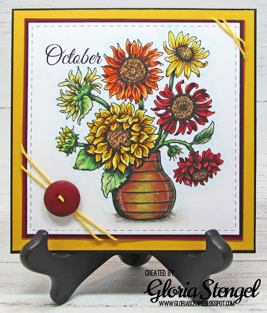
For those of you just joining me, I will be coloring one image each month, using the Power Poppy digital flower images, found HERE. If you missed out on the September project, click HERE.
Let's see OCTOBER project!
October is all about the rich reds, oranges, and golds with deep browns and rich greens! Growing up in central Pennsylvania, the mountains were a riot of color from all the maple trees in the area. That is how I will always see fall. Here in southern California, October looks pretty much like August...and June...and February! I try to surround myself with rich, fall colors through home decor.
Using Adobe Illustrator, I created my panel at about 5 1/4" x 5 1/4". I rotated the image slightly and sized it at approximately 4 1/4" wide.
The finished panel is 6 1/8" x 6 1/8". I have used a stitched square die to cut out the main image panel (which measures 5 1/4" x 5 1/4"). My plan is to display each monthly image at my desk, as shown above.
I am using "Great Vibes" as my font, which I sized at about 45pt. I printed the panel onto Hammermill 100# cardstock with my Epson ET-3700 using black ink. (So far, I have had excellent results using Copics with this printer ink and paper combination.)
I did a little research on color combinations for sunflowers and chose combinations in gold, yellow, red, and orange for my bouquet. My images are colored with a combination of Copic Markers and Prismacolor Pencils.
Here are the color combinations I have used for the finished project:
Leaves: G28, G40, G43, G46, YG0000, YG01
Pale yellow sunflower: Y00, Y11, Y13, Y17, YG21
Yellow bud: Y06, Y15, Y38, YR23
Golden sunflowers: Y11, Y15, Y17, Y35, Y38, YR04, YR24, colorless blender
Orange sunflower: YR00, YR04, YR09, YR18, YR68, colorless blender
Red sunflower: E18, E19, R14, R24, R46
Flower centers: YG13, YG21, E33, E37, E47, E49
All flowers: colored pencils dark brown, 90%warm gray
Vase: E08, E33, E35, E47, YG95, YR18, W00, W01, W03, W05; colored pencils white, 990% warm gray
Background: BG0000, BG000, W00, W01, W03, W05
I used a deep green to color the leaves, but then went back over some areas with the YG colors to "age" the leaves a bit. I think adding that bit of yellow-green gives the leaves a more realistic look. I colored the vase to look like a metal jug that is a bit rusty, with a green patina. I learned this technique at a Copic class a few years ago, and wanted to try it out on this vase, rather than make a pottery vase.
After all the coloring was finished, I die cut my image and then quadruple matted it, choosing black as my neutral color and adding other layers based on the colors within my image.
For this image, I chose golden yellow and a deep red cardstock. (I have no clue as to the manufacturer or color names of the cardstock. I found these sheets in my paper bins, but they were not marked - both were "one-off" so I cannot tell where they came from.)
I finished up with a bit of golden twine and a deep red button.
Thanks for joining me today. If you missed the September post, click HERE. I will have the next image in the series posted on November 1st. If you are enjoying this new series, leave a comment and tell me what images you'd like to see for other months!
Digital image: Power Poppy Sunshine of My Life
Cardstock: Hammermill 100# Digital Color Copy, golden yellow, deep red (unknown)
Markers: Copic (see list above)
Pencils: Prismacolor (see list above)
Gel pen: Sakura Gelly Roll White
Twine: Really Reasonable Ribbon Divine Twine Solid Yellow
Button: stash
Die: Elizabeth Craft Designs Stitched Squares
Tools: We R Memory Keepers Guide Layers
Adhesive: ATG tape, Scor-tape, hot glue


These Fall colors are so rich, Gloria. This card design is the perfect home decor when you don't have the change of seasons. I'm fortunate that I do--love Fall. Thanks for sharing this design to create for my favorite season.
ReplyDelete