
I am sorry to be a little late with this month's tutorial. My husband and I sneaked away for a few days, which put me behind in my coloring! We did not get a chance to go away for our wedding anniversary (32 years!) in September, so the little weekend vacation last week was squeezed in as a substitute!


That is the beauty of digital images. You can print them as many times as you wish! You can add sentiments, create your own sentiments, and even create your own scenes just like masking with traditional stamps!
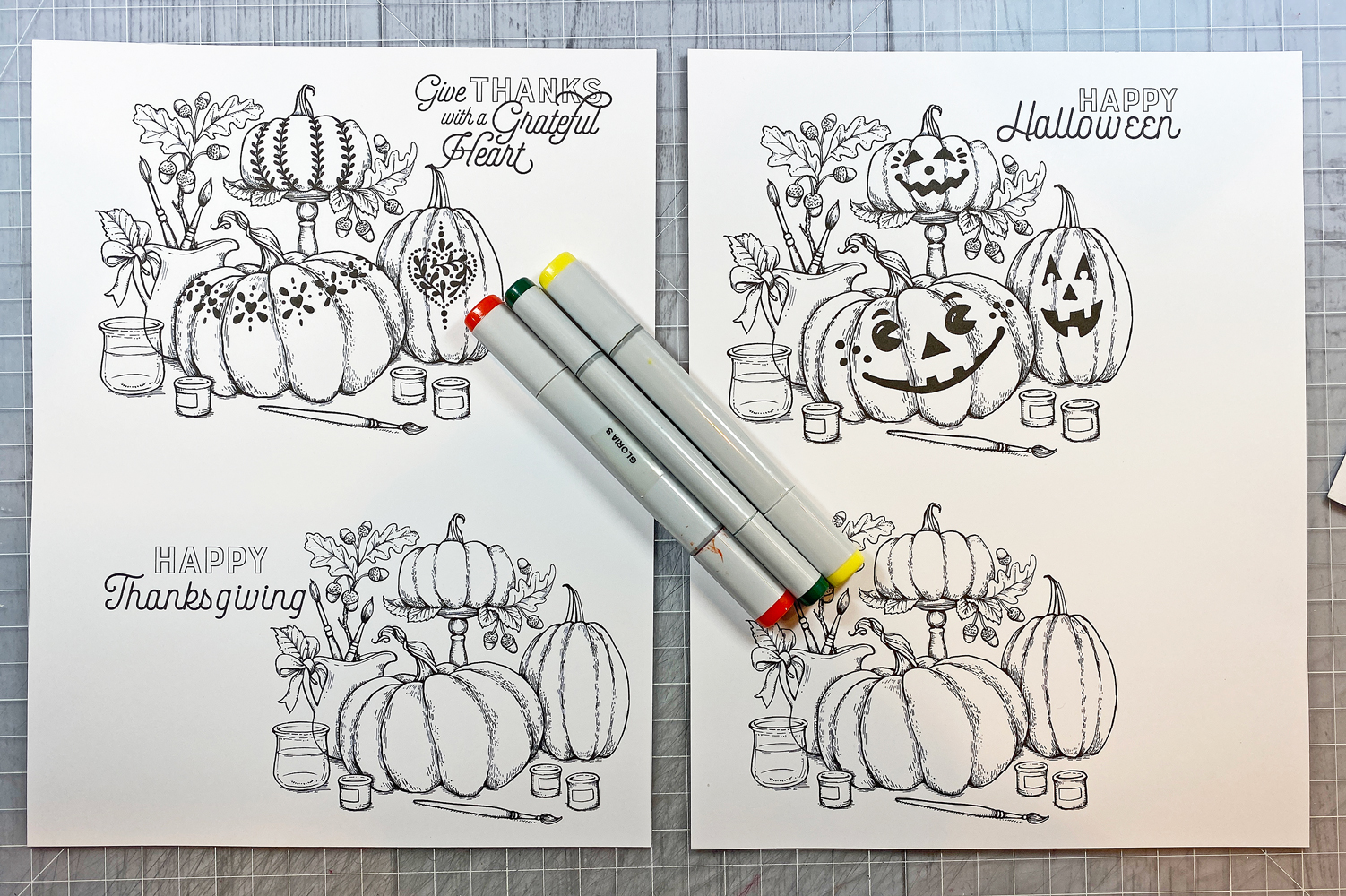
Follow the directions in the first post of the series to pick your paper, colors, and so forth. Since this image is called Painting Pumpkins, you can pretty much choose any colors you wish! I chose traditional fall colors, with a few pops of contrasting color.


Pumpkins, bow, oak leaves:
Copic: W5 Warm Gray 5, E15 Dark Suntan, YR18 Sanguine, YR15 Pumpkin Yellow, Y35 Maize
Prismacolor: PC944 Terra Cotta, PC1032 Pumpkin Orange, PC1002 Yellowed Orange, PC917 Sunburst Yellow, PC916 Canary Yellow, PC938 White, PC935 Black

For this picture, I started with the pumpkins. Using the colors listed above, I colored the pumpkins by putting down the layers of marker first, then going back and adding shadow and highlight with the pencils. Someone once said to use the right tool for the job...in this case BOTH markers and pencils are the right tools.

Stems:
Copic: YG97 Spanish Olive, E44 Clay, YG91 Putty
Prismacolor: PC946 Dark Brown, PC941 Light Umber, PC989 Chartreuse
I know some of you will want to know about light source. I don't really pay too much attention, because in real life, light comes from all around and hits objects on many surfaces. The strongest light is coming from the front right of the image, but there are other areas where light is hitting, and things have highlight and shadow depending on their placement next to each other. Also, pumpkins are an odd shape with lumps and bumps that catch the light.


I also chose brown for the paint brushes and the acorns because brown is a neutral. For the bow and the remaining leaves I used the same colors as I used for the pumpkins. Repeating the same colors across the image gives it cohesion. I repeated the main colors for the little paint pots - orange, black, aqua.
Repeating colors in different sections of an image keeps the image from turning "cartoon-y" or looking like a clown party is happening! If I had added a red pitcher or a pink bow they would have stood out and clashed with the rest of the image.
A side note about the acorns. To get the dull color I was after, I first gave them a wash of the BG05. Adding blue or gray under-painting to your image can give you shadow and depth when you layer other colors on top. The white dots on the acorn caps were added with a white gel pen.
Paint pots and brushes, acorns:
Copic: E27 Milk Chocolate, E25 Caribe Cocoa, E23 Hazelnut, E44 Clay, YG91 Putty, 100 Black, C9 Cool Gray 9, C7 Cool Gray 7, BG07 Petroleum Blue, BG05 Holiday Blue, BG02 New Blue, YR09 Chinese Orange, YR07 Cadmium Orange, YR68 Orange, Y21 Buttercup Yellow, Y32 Cashmere, E50 Eggshell
Prismacolor: PC942 Yellow Ochre, PC941 Light Umber, PC905 Aquamarine, PC921 Vermilion
Note: Older Copic E27 markers were called "Africano." E27 is now called called "Milk Chocolate." It is the same color, just with an updated name.
Green Leaves:
Copic: G28 Ocean Green, YG17 Grass Green, YG23 New Leaf
Prismacolor: PC935 Black, PC109 Prussian Green, PC989 Chartreuse, PC916 Canary Yellow
Pitcher, water jar:
Copic: C00 Cool Gray 0, C1 Cool Gray 1, BG07 Petroleum Blue, BG05 Holiday Blue, BG02 New Blue, BG000 Pale Aqua, BG0000 Snow Green
Prismacolor: PC935 Black, PC936 White, PC992 Light Aqua, PC905 Aquamarine

It is hard to see the background in the photo, but there is a colored pencil background. Once I had all the layers of color added, I "washed" over it with Gamsol blending solution and a blending stump.
Background:
Prismacolor: PC938 White, PC1077 Blender, PC289 Grey Green Light, PC1086 Sky Blue Light, PC1060 20% Cool Grey, PC1050 10% Warm Grey, PC1051 20% Warm Grey, PC1052 30% Warm Grey, PC1054 50% Warm Grey, PC1056 70% Warm Grey


Thanks for stopping by today! I hope you are inspired to color something!

Digital images: Power Poppy Painting Pumpkins
Cardstock: Hammermill 100# Digital Color Copy; Spectrum Ginger Snap, Caribbean; WorldWin Black
Printed paper: Authentique Twilight
Markers: Copic (see list above)
Pencils: Prismacolor (see list above)
Gel pen: Sakura Gelly Roll White
Blending solution: Gamsol
Enamel dots: Eyelet Outlet white (colored with BG07), Whimsy Stamps orange, Echo Park Travelers Notebook black
Flowers: Prima
Brad: stash
Ribbon: Really Reasonable Ribbon Tangerine Satin, Turquoise Organza Satin
Tools: We R Memory Keepers Guide Layers
Adhesive: ATG tape, Scor-tape, hot glue
Simply gorgeous. I thought you might enjoy that when I originally glanced at the card, I thought you colored the ribbons too! And first thought - how realistic they looked. :-) Happy Anniversary.
ReplyDeleteToo funny! I don't think I am that good yet to color such realistic ribbons. hee hee
Delete