Monthly Coloring Series Tutorial - September 2019
Welcome to the 2019 - 2020 Coloring Series Tutorials! We will be coloring at least one image every month starting this month (September 2019), and going through August 2020. We will be coloring a mix of digital images and hand-stamped images from Power Poppy, found HERE.
Each new coloring project will be posted on the 5th of each month. (I am not really working ahead, and life can happen, but this is the plan at any rate!) This new series will be a bit different from the last series. I plan to use floral images in a contain and NON-floral images when I can this year! Just to be a bit different than last year. (If you missed the 2018-2019 series, click HERE.)
I hope to create a few full tutorials, and maybe even try for some videos...we will see how I get on, and how much interest is shown in this project. For each project you will need images to color, stamped or printed onto cardstock that is made for alcohol markers. Each month I will share the image used, with a link to where you can purchase it.
The paper I use is Hammermill 100# cardstock, but there are other brands that will work, including Copic X-Press It cardstock. I prefer the Hammermill because it is a brighter white than the Copic, which reads a bit on the gray side to my eye. Plus, the Hammermill is a lot cheaper and it's a bit thicker. It goes through my Epson Eco Tank ET-3700 printer very well, as long as I choose the "presentation paper" setting, or a cardstock setting.
If you are hand-stamping your images, use a Copic-friendly ink such as Tsukineko Memento dye ink. Since you will be printing or stamping onto a very smooth paper, you will need to allow a bit of ink drying time before coloring. I try to wait 15-20 minutes before coloring my printed or stamped images.
My images are colored with Copic Markers and Prismacolor Premier Colored Pencils. I use a combination of the Ciao and Sketch markers. They are EXACTLY THE SAME markers, except the Ciao is a bit smaller (they hold less ink) and come in fewer colors. The Ciao are also a bit cheaper per marker. I use the Prismacolor Premier 150 pencil set of pencils to add some shading, detailing, or highlighting. We may create a few projects with pencils ONLY during the course of the year. (I may also add other pencil brands, but will discuss those at the appropriate time.)
I also use some white pens, such as Sakura Gelly Roll, Signo Uni-Ball, or the Posca paint pens. Any of these will work for our needs and can be found on Amazon, or at most art supply stores.
Before we start, please keep in mind that I am NOT an artist or illustrator. I am a self-taught colorist. I am going to share with you what works for me. You may have something that works better for you, and that is perfectly fine. Now, let's get started with our project!
We will be coloring an image from the Bountiful Bouquet digital stamp set, which is a $6 download. (Another thing to note is that I do NOT get anything from Power Poppy by sending you there to purchase stamps! Nor do I get any free product for my own use. I buy what I want to work with out of my own funds, and I share my projects with you for FREE.)
Edited to add: Since this post went live I was asked to join the Power Poppy Instant Gardener team. Which means I receive all the digital stamps for free in exchange for coloring a few images per month. I will continue to provide HONEST and TRUE feedback about these images! I will continue to share FREE content on this blog and on my YouTube channel.
We are also using a digital sentiment from the Cuppa Buttercups digital stamp set, which is a $5 download. You may use any stamped or digital sentiment you have on hand. However, if you wish to use a digital sentiment, please add it BEFORE you print your image!
If you have never worked with digital images before, please check out THIS tutorial.
Edited to add: Since this posting I have added THIS tutorial about combining digital images.
I use Photoshop Elements to size my images, add sentiments, and to print. There are loads of programs, including Microsoft Word, that you can use to size and print your images. I won't go into all that here as you can Google that information for yourself.
I sized the image to approximately 5 3/4" tall, making it roughly 4" wide. I added the sentiment to the lower left area as shown above. The sentiment is slightly smaller than 2 1/4" wide. I printed in black ink.
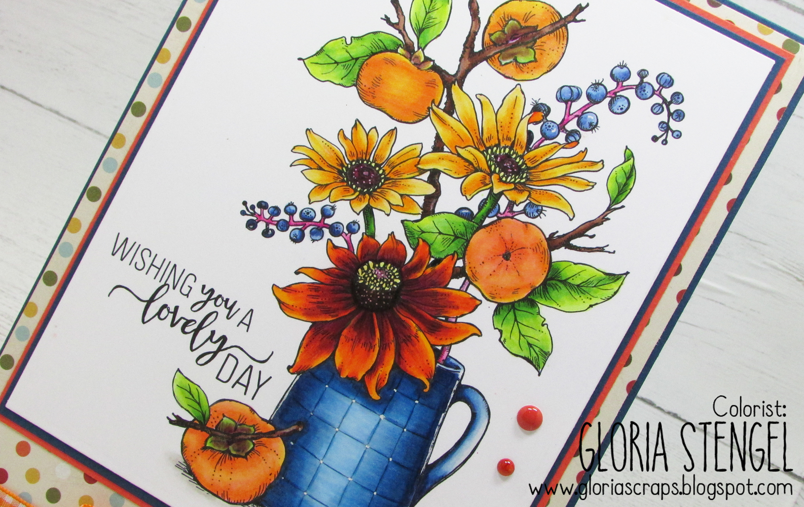
I always print one copy onto regular computer paper so that I can check the size, positioning, and so forth, plus make some notes to myself. This image contains Black-eyed Susans (also called Rudbeckia or Coneflower), Pokeweed Berries, and Persimmons. I decided the jar was pottery and should be painted in a check or gingham pattern (which changed as I colored).
Once I know what flowers my image contains, I do a Google search for actual images. I found that there is a type of Rudbeckia called Cherokee Sunset Black-eyed Susan, which is more orange and deep burgundy! Very pretty. I also liked the hot pink stems of the Poke Weed Berries. I printed my source images onto computer paper, in color so I would have them for reference as I color. You can just view the images on a computer, laptop, or mobile device if you want to save your colored printer ink!
While I am looking for source material, I print my image onto cardstock and set it aside to dry. You can choose to print your image at any size, or even copy the style of the last series and add the month instead of a sentiment. To see how I printed the 2018-2019 series, click THIS link.
The next step is to make some color swatches and choose our colors. I pulled out my Copic (and Prismacolor) charts and some strips of cardstock. I use the same cardstock that my final image has been printed on. I always have scraps of it about the place. (For the Hex Chart shown, click HERE. For the FREE blank Copic color chart, click HERE. For the Prismacolor Hex Chart, click HERE. There are lots of FREE Prismacolor pencil carts out there. Find one you like on Google and print it out.)
Using your color charts and your source photos, make some swatches to help you choose your colors. Try for a light, medium, and dark blend. I usually have 3-6 markers in each blend, unless it's for a tiny area, then I may only have two.
Once I have my colors chosen, I swatch them again, making sure I can blend from dark to light. I also see if I may need a few pencils to deepen shadows or to add highlights. (I really need to create a swatch book so I don't have to swatch so often before a project!)
If you need some coloring instruction, YouTube has a plethora of videos teaching all sorts of art fundamentals, Copic and pencil coloring, and more. If you prefer a guided class, I can recommend Kit and Clowder online classes, or Vanilla Arts. Both artists have free and paid content.
I decided the light source for my image would be bright daylight, sort of coming from the top and front of the image.
To color the petals of the black-eyed Susans, I used Copics Y38, Y17, Y32 (listed dark to light). I added Prisma pencils PC118 and PC916 for some extra shading and highlight.
I color dark to light most of the time. I add in my shadows, and then blend gradually lighter. I go back and add more shadows and highlights as needed. There are many schools of thought about coloring. Should you color dark to light, or should you color light to dark, or should you cover the whole image with the lightest color first, and so on. You pick what works best for your style!
For the flower that looks like a Cherokee Sunset Black-eyed Susan, I used RV69, R38, YR68, Y38, PC1095, PC118, PC916. I blended the deep burgundy reds into the orange to get this look.
This is a tough blend and it wanted to bleed all over the place! I had to allow some dry time between layers of ink to keep it from making a mess! This is the point when you may want to toss your project in the trash! But, keep going! It does look a bit ugly before it gets awesome! Push past the ugly stage!
For all the flower centers, I used RV69, E49, E79, RV69, V15 in a stippling (dot) method. I added white gel pen for highlight, then colored over it lightly with the PC1095.
Before coloring the Persimmons, I added a highlight mark using Y02. This was just to remind me to make sure to add a highlight.
I wanted to vary the colors of the persimmons, because they are not uniform in nature! Therefore, one is more orange, one more peach, one more yellow, and so on. I used a combination of R22, YR12, YR02, E95, E93, and Y02. I added PC938, PC1013, and PC1001 for more dimension.
Another thing to note: close up photos will show every imperfection in your coloring! Keep that in mind if you post your work Online. Especially if you use colored pencils. The wax bloom with show up in the photos sometimes...and it does not look that great!
Next are the pokeweed berries and stems. I used B39, B21, and a white gel pen for the berries. This is another tough blend. But, if you can achieve it, you have great highlights on the berries, and you won't need to use much of the gel pen!
For the stems RV19, RV17, RV10 and PC994. I went back later and darkened some of the berries that were more in shadow.
The persimmon branches are E29, E27, E25 with white highlights. The persimmon leaves and the black-eyed Susan stems are YG17, YG25, YG23, YG03, YG01, and PC109, PC912, and PC989.
The stems (where the fruit attaches to the branch) are RV69, RV25, YG25, YG01, PC989, PC1078, and PC1095. The stems are a sort of "non-blend." If you look at them in nature, they are a mix of brown and green as the fruit ripens.
I had a mistake with the pitcher, so I ended up coloring it a solid blue rather than the gingham I had planned. I ran the really dark blue into an area that should have been white, and there is no taking that back! Rather than get in a fuss and toss out the project, I switched gears a little. I used B39, B37, B45, C03, B21, PC901, PC906, PC904, PC1086, and PC938 for the pitcher. I used a white gel pen for the highlights.
For the shadow under the pitcher, I used W03, W01, W00.
Now that our coloring is finished, you may stamp a sentiment onto the panel, if you did not print one at the beginning.
I cut the finished image into a rectangle using a die, but you can do it by hand with a trimmer. The finished image is 6 1/2" tall and 5" wide.
I found some envelopes that would fit a card that is a little smaller than 9" tall and 6" wide, so decided to construct a card from the finished image to fit that size envelope.
Let's make a card!
Cut blue cardstock to 8 3/4" x 5 3/4". Cut a second piece to 9 1/4" x 5 3/4" and score at 1/2" from the top edge. Use the resulting tab to attach the two pieces of cardstock together to make a top-fold card that is 8 3/4" x 5 3/4".
Cut dot paper (Authentique Pleasant Three) to 8 5/8" x 5 5/8". Wrap the bottom edge of the dot paper with an 8" length of orange plaid ribbon. Top the ribbon with an 8" length of fall colored ric-rac. Attach the dot panel to the card front.
Double mat the image with blue and orange cardstock, cut slightly larger (blue 6 5/8" x 5 1/8" and orange 6 3/4" x 5 1/4"). Attach the image to the card front as shown above.
Make a bow from the orange plaid ribbon and hot glue it to the center of the ribbon stack, as shown. Add a few enamel dots or flat pearls to the image panel.
Trim two pieces of white cardstock to 8 5/8" x 5 5/8" and attach the panels to the inside of the card.
We are keeping the project fairly flat so that it fits into our envelope.
A 6” x 9” envelope weighing up to 1 ounce requires one $.50 first class rate stamp. For each additional ounce, you'll have to pay $0.21. Since this card is just a little lumpy, I may add a little more postage, just in case. I may also slip a piece of scrap cardstock into the envelope to cover the front of the card and prevent anything poking through.
Thanks for stopping by! I hope that you were able to follow along with the tutorial. Please come back next month to see what we will color for October!
Also, I mentioned that our images would be a bit different from the last series. I plan to use some images that are NOT flower bouquets, plus all the bouquet images will be in some sort of container this series! Please leave any comments or questions below! I want to hear from you how you liked this first tutorial. But, please, do no beg for video tutorials. They are not really my strong suit, and I have to really plan ahead if I want to do one...so no guilt trips, ok!? {smile}
Digital images: Power Poppy Bountiful Bouquet, Cuppa Buttercups
Cardstock: Hammermill 100# Digital Color Copy; blue, orange (unknown)
Printed paper: Authentique Pleasant
Markers: Copic (see list above)
Pencils: Prismacolor (see list above)
Gel pen: Sakura Gelly Roll White
Enamel dots: Carta Bella It's a Boy
Ribbon: Really Reasonable Ribbon Orange Plaid
Ric-rac: from my stash
Die: Spellbinders Grand Rectangles
Tools: We R Memory Keepers Guide Layers
Adhesive: ATG tape, Scor-tape, hot glue


That is sooooo beautiful! Such a great breakdown of the techniques too :-) Thank you. Jayne x
ReplyDeleteBeautiful coloring and card! I just found you and I have been in a slump not even wanting to color, so I think I will give this a try. Thanks for sharing your talent!
ReplyDelete